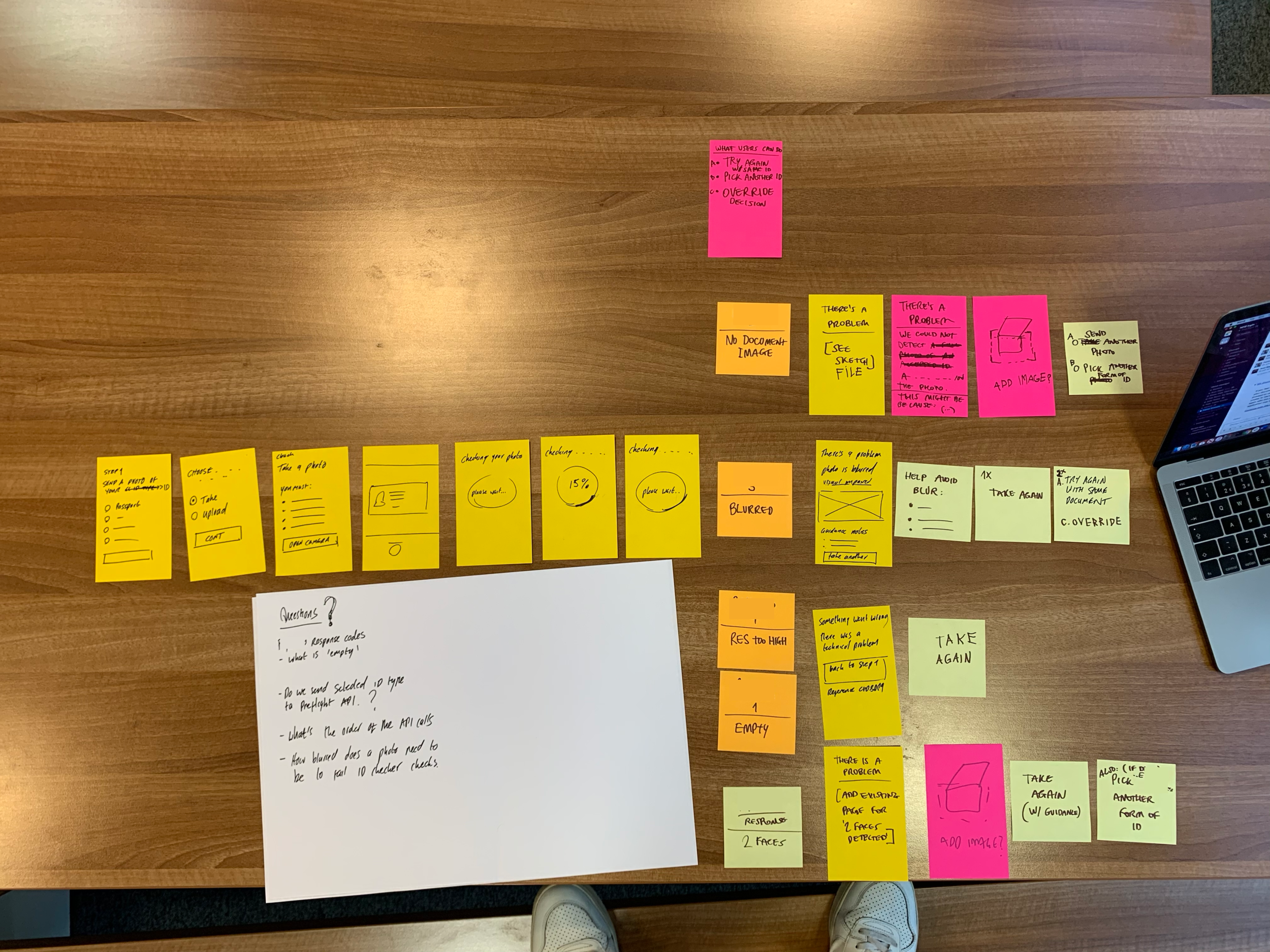
Helping users get through identity verification when uploading and taking photos of their I.D. documents 📷 💳
NHS login makes it easier and quicker for you to securely access digital health and care services with one username and password. These credentials can be used for the NHS App. In order to gain access to the full NHS app, you need to undergo some form of identity verification by submitting photos of your I.D. documents.
Whilst working at NHS Digital as an Interaction Designer, I was part of a multidisciplinary team made up of user researchers and content designers, focusing on the photo upload journey when a user is going through the identity verification journey.


The main purpose of this work was to allow users to get through the identity verification process in the quickest way, and to avoid the need for any manual checks which can take longer to complete.
Initially, the scope included to look at a range of issues that can occur with photo taking and photo upload of the document, however the scope was adjusted and we focussed mainly on the issue of blur.

Key points of consideration
Working at NHS Digital meant that accessibility had to be considered first before anything else. Some of the key design considerations for this journey was:
Content is king - Working with a skilled content designer to build the journey in the most inclusive and relatable way to ensure the journey was as informative as possible.
Never leave the user at a dead end- This work was heavily centred around ‘unhappy’ paths. Photo submission of I.D. documents was identified as part of the end-to-end process where users were failing the most. The key to keeping the user on track and minimising anxiety was to always give the user a range of options to successfully complete the process.
Accommodate a range of accessibility issues - The main accessibility issues to accommodate in this journey included problems with vision (which can make the ‘review your photo’ stage difficult to complete. And also, motor impairments (which can cause involuntary actions with limbs such as shaking, meaning taking clear and focused photos of I.D. documents can be extremely difficult). We wanted to support users, even if they had some of these conditions but they thought they might be able complete the process. And if they had an attempt and the end result wasn’t sufficient to pass the process, then they would always be provided with clear alternative routes they can take.
Don’t think of scenarios as ‘edge cases’ - Working on a service that is used by millions of people, we never assumed that everyone had high levels of digital confidence. This process was rather complex in that it involved the user using the NHS app, then having to upload or take an image, and then having to check it, (and this was only a small part of the end-to-end journey). Having clear, prominent options for accessible routes was essential.
Make the process digestible - As this process isn’t only undertaken on a native app (it can also be complete via web), it meant we were unable to use smart, user friendly technology (such as that which is used when taking a photo of your credit card in an app and it places a frame around your card when the camera is open) Instead, it meant the user had to review their photo manually by answering a series of questions when viewing a playback. To minimise cognitive load, we kept the questions short and clear, and only 1 point per screen (as GOV design guidelines suggest)


